Arc
arc.net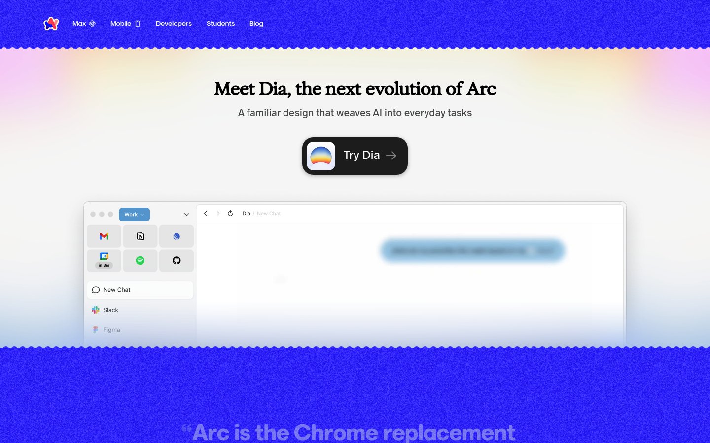
Heading system
GT America · 24–48px / 400
Body system
GT America · 14–16px / 400 / 1.6
Headings: Bold serif-influenced display, centered, ~48px hero with tight tracking
Body: ~18px/1.5 regular weight, muted gray color for subheadings, high readability
Hierarchy: Strong contrast between bold display headlines and lighter descriptive text, minimal intermediate levels
geometric humanist sans-serif
Possibly: GT America
Letters
Aa Bb Cc Dd
Ee Ff Gg Hh Ii
Jj Kk Ll Mm
Nn Oo Pp Qq
Rr Ss Tt Uu
Vv Ww Xx Yy Zz
Numbers
01 02 03 04 05
06 07 08 09
Layout
single-column
Density
sparse
Spacing
airy
Framing
Centered single-column layout with generous max-width (~1200px)
Design Principles
- Use warm multi-color gradients to inject personality without overwhelming content
- Center all primary content to create focused, narrative-driven scrolling
- Show the actual product interface early to ground abstract AI claims in reality
- Keep navigation minimal and unobtrusive with subtle text links
- Layer soft gradients behind content sections for depth without harsh borders
Signature Moves
Color: Gradients transition from vibrant blue through purple to pink and peach, creating warmth and approachability. The white content area provides contrast and focus, while gradient edges frame without confining.
Typography: Clean sans-serif with subtle serif qualities in headlines creates approachable authority. Light subheading weights soften the messaging while bold CTAs drive action.
Grid: Centered single-column layout with generous max-width (~1200px), content blocks centered with significant vertical spacing
Flow: Hero with headline, CTA, then product mockup demonstration, followed by testimonial section
Whitespace: Extensive whitespace creates breathing room around hero content, gradient backgrounds provide visual separation without hard dividers
Aesthetic
playful
Feel
warm
Industry
consumer
Arc's landing page employs a warm, gradient-rich aesthetic that balances playfulness with product credibility. The vibrant blue-to-pink gradients create visual energy while the centered layout and generous whitespace keep the experience calm and focused. The product mockup grounds the AI messaging in familiar UI patterns, making the 'next evolution' positioning feel accessible rather than intimidating.
Navigation
top bar
CTA Style
filled button
Title block
Description copy reflects the measured line length, icon offset, and CTA spacing.
Scale
Gaps
Card Padding
The design succeeds by making AI feel friendly rather than threatening. Warm gradients and familiar UI patterns reassure users that this 'evolution' enhances rather than disrupts their workflow. The centered, spacious layout creates a premium feel appropriate for a next-generation product.
Key Strengths
- Immediate product demonstration grounds abstract AI claims in tangible interface
- Gradient color story creates distinctive brand recognition across touchpoints
- Minimal navigation keeps focus on the core value proposition
- Testimonial section with gradient text maintains visual interest below the fold
- CTA button design incorporates brand identity through gradient icon
Target Audience
Tech-forward professionals who want productivity gains without a steep learning curve, likely current Arc or Chrome power users ready for AI augmentation.
Steps
- 01Set up a single-column centered layout with max-width ~1000px and generous vertical padding (~120px sections)
- 02Create a multi-stop linear gradient (blue → purple → pink → peach) for top and bottom sections
- 03Add a wavy SVG divider between gradient and white content areas
- 04Style headlines in a bold sans-serif at ~48px with tight letter-spacing
- 05Create a pill-shaped CTA button with dark background, white text, and gradient icon
- 06Build a browser mockup component with subtle shadow and familiar app grid
- 07Apply gradient text effect to testimonial or accent sections
- 08Keep navigation text-only in the header with subtle hover states
Key Decisions
- Choosing warm rather than cold gradients to signal friendliness
- Showing real product UI early rather than abstract illustrations
- Using organic wavy borders instead of hard geometric dividers
- Centering all content rather than using an offset grid
- Keeping the CTA button prominent with high contrast
Pitfalls to Avoid
- ✕Don't let gradients become too saturated or psychedelic—keep them soft
- ✕Avoid cluttering the hero with too many CTAs or secondary messaging
- ✕Don't use generic stock mockups—the product demo must feel authentic
- ✕Avoid hard shadows that conflict with the soft gradient aesthetic
CSS Variables
:root {
  --primary: #4f46e5;
  --secondary: #f97316;
  --accent: #ec4899;
  --bg: #ffffff;
  --text: #0f172a;
  --radius: ~16px;
  --font-body: GT America, system-ui, sans-serif;
  --gradient-start: #4f46e5;
  --gradient-mid: #a855f7;
  --gradient-end: #fcd34d;
}
Key Techniques
- Multi-stop CSS linear gradients for background sections
- SVG path for wavy section dividers
- CSS background-clip: text for gradient text effects
- Box-shadow with low opacity for floating card elements
- Flexbox centering for single-column layout
Framework: Next.js or Astro for static marketing site, Tailwind CSS for rapid gradient and spacing utilities, Framer Motion for scroll-triggered animations.
Responsive: Layout likely stacks vertically on mobile with reduced padding. Browser mockup may shrink or scroll horizontally. Navigation likely collapses to hamburger below 768px.
Do
- ✓DO use warm, multi-color gradients as brand signature throughout the page
- ✓DO show the actual product interface early to build credibility
- ✓DO keep navigation minimal with text links only
- ✓DO use generous whitespace to let content breathe
- ✓DO create visual interest with gradient text on key quotes
- ✓DO use organic, wavy dividers instead of hard lines
Don't
- ✕DON'T use cold or harsh color combinations that conflict with the friendly tone
- ✕DON'T clutter the hero section with multiple competing calls-to-action
- ✕DON'T use generic placeholder content in product mockups
- ✕DON'T add heavy drop shadows that conflict with soft gradient aesthetic
- ✕DON'T make the page feel corporate—maintain playful, approachable energy
- ✕DON'T use hard geometric dividers between sections
Create a landing page for a consumer tech product with a warm, friendly aesthetic. Use a color palette centered on vibrant blue (#4f46e5), soft purple (#a855f7), pink (#ec4899), and peachy orange (#f97316). Background sections should use multi-stop linear gradients transitioning through these colors. The layout is single-column, centered, with max-width ~1000px and generous vertical padding (~100-120px between sections). Typography uses a geometric sans-serif like GT America or Inter, with bold ~48px headlines and ~18px body text in muted gray. Create a hero section with centered headline, short subheading, and a prominent dark pill-shaped CTA button (~56px height, ~16px border-radius) featuring a gradient icon. Below the hero, add a wavy SVG divider transitioning to a white content area containing a floating browser mockup with subtle box-shadow. Include a testimonial section with gradient-colored quote text. Keep navigation minimal with text links only. The overall feel should be optimistic, approachable, and premium without being corporate.
Generated from visual analysis — verify specific values before use.
Free to start
See the language behind great design
Analyze any website. Learn its palette, type system, and layout DNA — then prompt it precisely.