Craft
craft.do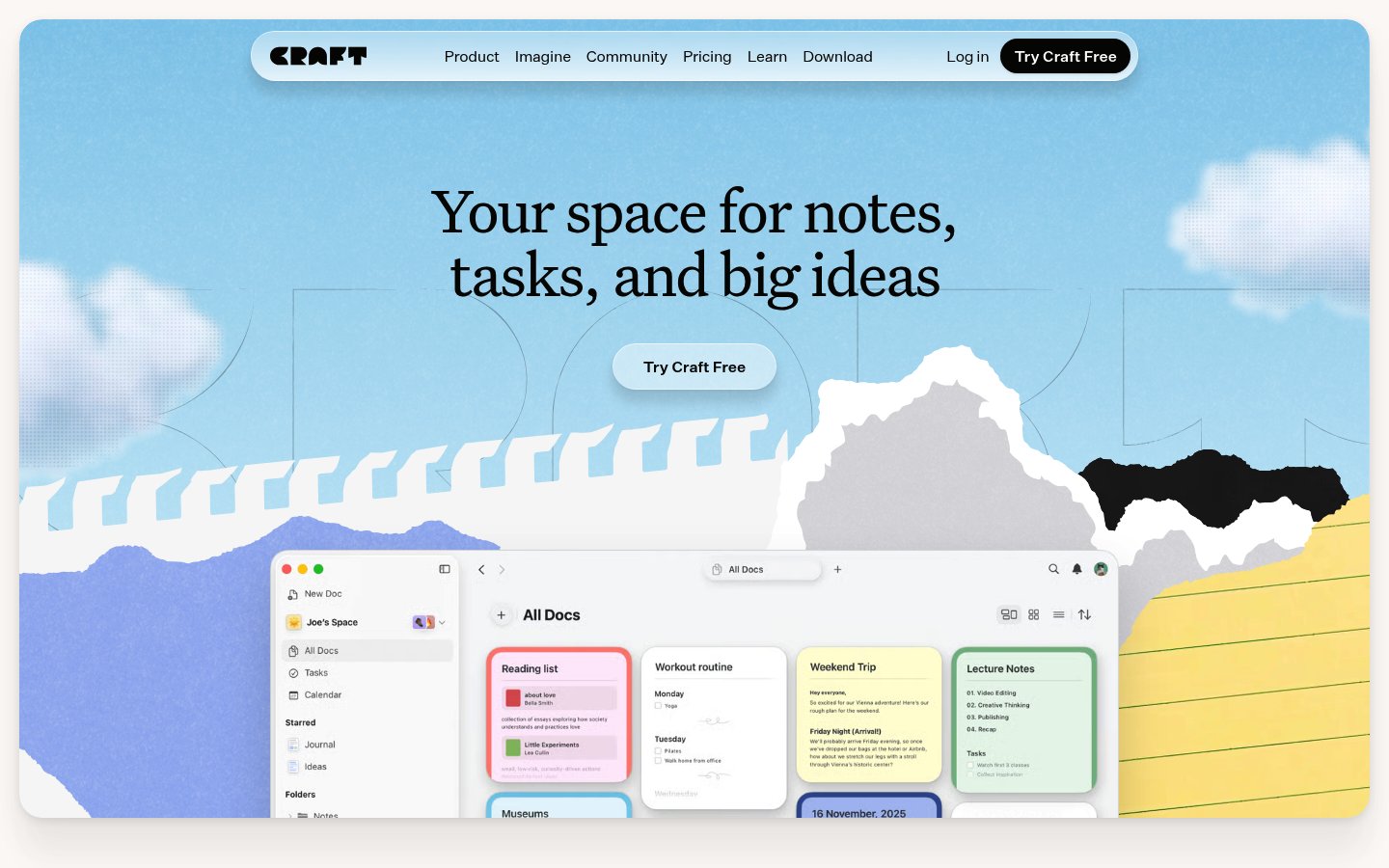
Heading system
Recoleta · 24–48px / 400
Body system
Inter · 14–16px / 400 / 1.6
Headings: Large serif with soft curves, ~56px hero size, regular weight, sentence case
Body: ~16px sans-serif, regular weight, comfortable line-height ~1.5
Hierarchy: Strong contrast between decorative serif headings and functional sans-serif UI text, creating warmth balanced with clarity
soft rounded serif
Possibly: Recoleta
clean humanist sans-serif
Possibly: Inter
Letters
Aa Bb Cc Dd
Ee Ff Gg Hh Ii
Jj Kk Ll Mm
Nn Oo Pp Qq
Rr Ss Tt Uu
Vv Ww Xx Yy Zz
Numbers
01 02 03 04 05
06 07 08 09
Layout
single-column
Density
sparse
Spacing
airy
Framing
Centered single-column layout
Design Principles
- Illustration as differentiator — paper-craft textures create tactile warmth
- Contrast serif headlines with sans-serif interface for personality without sacrificing usability
- Use sky/nature metaphors to suggest openness and creative freedom
- Color-coded cards within product UI to show organization without complexity
Signature Moves
Color: Soft blue gradient evokes calm and openness, while saturated color-coded cards within the app preview demonstrate organization. Black text and buttons ground the playfulness with professionalism.
Typography: Rounded serif headlines inject warmth and creativity into a productivity tool category dominated by geometric sans-serifs, making Craft feel more personal and less corporate.
Grid: Centered single-column layout, ~1200px max-width, hero content centered with generous margins
Flow: Hero with headline and CTA flows into illustrated product showcase below
Whitespace: Generous whitespace frames the hero content, creating breathing room that emphasizes the playful illustration
Aesthetic
playful
Feel
warm
Industry
saas
Craft employs a warm, inviting aesthetic that stands apart from typical productivity tool coldness. The paper-craft style illustration with torn edges and layered textures creates a tactile, creative feel. The combination of soft rounded serif typography for headlines with clean UI patterns strikes a balance between personality and usability. The sky-blue gradient with cloud elements suggests open possibility and creativity.
Navigation
top bar
CTA Style
filled button
Title block
Description copy reflects the measured line length, icon offset, and CTA spacing.
Scale
Gaps
Card Padding
The design succeeds by humanizing productivity software through tactile illustration and warm typography. It signals 'creative tool' rather than 'corporate software,' appealing to individuals and creative professionals who want their workspace to feel inspiring rather than sterile.
Key Strengths
- Paper-craft illustration creates memorable visual identity
- Serif typography differentiates from competitors
- Product screenshot integrated into hero shows real value immediately
- Color-coded cards demonstrate organization capability at a glance
- Single clear CTA reduces decision fatigue
Target Audience
Creative professionals, writers, and individuals seeking a productivity tool that feels personal and inspiring rather than corporate.
Steps
- 01Start with a soft blue-to-white gradient background
- 02Choose a rounded serif for headlines (Recoleta, Freight Display, or similar)
- 03Pair with a clean sans-serif for UI and body text
- 04Create paper-craft style illustrations with torn edges and layered depth
- 05Add subtle shadow and depth to illustration elements
- 06Place product screenshot within the illustrated scene
- 07Use a single prominent CTA button with rounded corners
- 08Implement generous padding throughout, especially in hero section
Key Decisions
- Choosing serif over sans-serif for headlines — adds warmth
- Paper-craft illustration style — creates tactile, creative association
- Product UI visible in hero — demonstrates value immediately
- Soft gradient rather than flat color — adds depth without complexity
Pitfalls to Avoid
- ✕Don't over-illustrate — maintain balance with clean UI elements
- ✕Avoid making the serif too decorative — keep it readable
- ✕Don't let colorful cards compete with primary content
- ✕Resist adding multiple CTAs — keep focus singular
CSS Variables
:root {
  --primary: #000000;
  --bg: #f5f7fa;
  --sky-blue: #7ac4e8;
  --accent-yellow: #f5e55a;
  --radius: ~12px;
  --radius-lg: ~24px;
  --font-heading: Recoleta, Georgia, serif;
  --font-body: Inter, system-ui, sans-serif;
}
Key Techniques
- CSS gradient backgrounds with subtle color stops
- SVG or PNG illustrations with careful layering
- Box-shadow for depth on product screenshots
- Rounded corners on buttons and cards
- Centered flex or grid layout for hero
Framework: Well-suited for Next.js or Astro with Tailwind CSS. Illustrations likely optimized SVGs or carefully compressed PNGs for performance.
Responsive: Hero likely stacks to single column on mobile with illustration scaling down. Navigation probably collapses to hamburger menu on smaller screens.
Do
- ✓Use generous whitespace to let illustrations breathe
- ✓Maintain high contrast for text readability despite playful elements
- ✓Show the actual product early to demonstrate value
- ✓Use color-coding meaningfully within product UI
- ✓Keep CTAs simple and prominent
- ✓Layer illustrations to create depth and interest
Don't
- ✕Don't let decorative elements distract from core message
- ✕Avoid using too many different colors outside the illustration
- ✕Don't make the serif font too stylized for body text
- ✕Avoid cluttering the hero with multiple actions
- ✕Don't use harsh shadows — keep everything soft
- ✕Avoid generic stock illustrations — maintain craft aesthetic
Create a landing page for a productivity app with a warm, creative aesthetic. Use a soft blue-to-white gradient background (#7ac4e8 to #f5f7fa). Headlines should use a rounded serif font like Recoleta in black (#000000), ~48-56px for the hero. Body text uses Inter or similar sans-serif at ~16px. The hero should feature a large centered headline with a single pill-shaped CTA button (white background, black text, ~12px border-radius). Below the headline, include a product screenshot embedded within illustrated paper-craft elements — think torn paper edges in blues, grays, and yellows with subtle layering and shadows. Add floating cloud illustrations in the background. Use rounded corners (~12-24px) throughout. The overall feel should be friendly, creative, and approachable — not corporate. Color-coded cards (red, green, blue, orange) should appear in the product UI to show organization features. Keep the layout centered and single-column with generous padding (~80-120px section spacing).
Generated from visual analysis — verify specific values before use.
Free to start
See the language behind great design
Analyze any website. Learn its palette, type system, and layout DNA — then prompt it precisely.