Figma
figma.com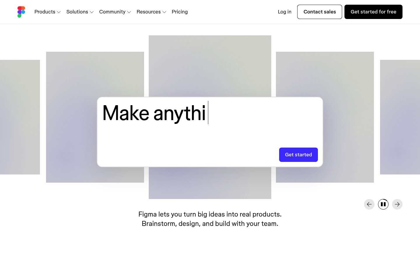
Heading system
Whyte · 24–48px / 400
Body system
Whyte · 14–16px / 400 / 1.6
Headings: Bold black sans-serif, ~64px hero with typing animation effect, tight letter-spacing
Body: ~18px/1.5 regular weight, comfortable reading line-height, centered alignment
Hierarchy: Strong hero headline dominance, minimal supporting text, clear CTA separation
geometric humanist sans-serif
Possibly: Whyte
Letters
Aa Bb Cc Dd
Ee Ff Gg Hh Ii
Jj Kk Ll Mm
Nn Oo Pp Qq
Rr Ss Tt Uu
Vv Ww Xx Yy Zz
Numbers
01 02 03 04 05
06 07 08 09
Layout
single-column
Density
sparse
Spacing
airy
Framing
Full-width background canvas with centered content overlay
Design Principles
- Let the product speak through contextual background imagery
- Single focal point with typography as hero element
- Muted backgrounds amplify foreground messaging
- Motion as personality, not distraction
- Dual CTA strategy: primary dark, secondary outlined
Signature Moves
Color: Near-monochromatic foundation with soft purple accents that reference Figma's brand while maintaining professional restraint
Typography: Single geometric sans-serif at scale creates confidence; the type itself becomes the visual centerpiece rather than supporting graphics
Grid: Full-width background canvas with centered content overlay, ~1200px max-width for text content
Flow: Hero-centric single viewport experience with layered card elements creating depth
Whitespace: Generous whitespace frames central messaging, background gallery provides visual interest without competing
Aesthetic
minimal
Feel
approachable
Industry
developer-tool
Figma's homepage employs a confident, minimal approach with a dramatic typing animation hero that cycles through creative possibilities. The layered card gallery background creates depth while remaining muted, ensuring the central value proposition commands attention. The design balances product sophistication with accessibility through generous whitespace and a restrained two-color palette accented by soft purple tones.
Navigation
top bar
CTA Style
filled button
Title block
Description copy reflects the measured line length, icon offset, and CTA spacing.
Scale
Gaps
Card Padding
The design immediately communicates what Figma enables rather than what it is, showing creative possibilities through the animated headline and background gallery. The restraint in color and density signals professional-grade tooling while remaining welcoming to new users.
Key Strengths
- Typing animation creates engagement and demonstrates product versatility
- Background gallery shows real work without overwhelming the message
- Clear value proposition in two concise sentences
- Dual navigation CTAs serve different user intents
- Pause controls respect user preference for motion
Target Audience
Design professionals, product teams, and creative individuals seeking collaborative design tools
Steps
- 01Set up full-viewport hero section with white centered card overlay
- 02Implement typing animation cycling through product use cases
- 03Create background gallery with muted, overlapping card grid
- 04Apply soft purple-gray gradient to background cards
- 05Build navigation with logo, dropdown menus, and dual CTA buttons
- 06Add carousel controls with prev/pause/next functionality
- 07Center supporting tagline text below hero card
- 08Ensure generous vertical spacing between all elements
Key Decisions
- Using typing animation instead of static headline
- Muting background content to 60-70% opacity
- Placing CTA inside hero card rather than below
- Soft rounded corners on all interactive elements
- Dark primary CTA contrasting with outlined secondary
Pitfalls to Avoid
- ✕Making background gallery too vibrant or attention-grabbing
- ✕Speeding up the typing animation too much
- ✕Adding more than two sentences of supporting copy
- ✕Using multiple accent colors that compete for attention
CSS Variables
:root {
  --primary: #000000;
  --bg: #ffffff;
  --accent: #a259ff;
  --muted: #c4b5d4;
  --radius: ~12px;
  --radius-lg: ~24px;
  --font-body: Whyte, system-ui, sans-serif;
}
Key Techniques
- CSS Grid for background card gallery layout
- Typewriter effect with JavaScript interval
- Backdrop blur or opacity for depth layers
- Smooth transition on hover states
- Sticky navigation with transparent background
Framework: React with Framer Motion for typing animation; Tailwind CSS for rapid utility-based styling
Responsive: Background gallery likely collapses to fewer visible cards on tablet; hero card maintains prominence with adjusted padding
Do
- ✓Keep the hero message under 10 words
- ✓Use muted tones for any background imagery
- ✓Implement smooth, unhurried animation timing
- ✓Provide motion controls for accessibility
- ✓Maintain strong contrast for primary CTA
- ✓Let whitespace do the heavy lifting
Don't
- ✕Add competing visual elements to the hero area
- ✕Use bright colors in the background gallery
- ✕Overwhelm with multiple animation types simultaneously
- ✕Place navigation CTAs in low-contrast styles
- ✕Add more than one headline treatment
- ✕Crowd the supporting copy with features
Create a SaaS landing page hero section inspired by Figma's design. Use a white background (#ffffff) with black text (#000000). Build a centered hero card with ~24px border-radius containing a typing animation headline that cycles through phrases like 'Make anything', 'Design together', 'Build faster'. Use a geometric sans-serif font (Inter or similar) at ~64px bold for the headline. Add a single 'Get started' CTA button with black background, white text, and ~8px border-radius. Below the card, center a two-line tagline at ~18px regular weight. Behind the hero, create a grid of muted design preview cards with soft purple-gray gradients (#c4b5d4 to #e8e4ed) at reduced opacity (~70%). Cards should overlap slightly and have ~12px border-radius. Navigation: logo left, dropdown menus center, 'Log in' text link and two buttons right ('Contact sales' outlined, 'Get started for free' filled black). All spacing generous—~120px section padding, ~32px gaps. Motion: typewriter effect at ~100ms per character, soft hover transitions.Generated from visual analysis — verify specific values before use.
Free to start
See the language behind great design
Analyze any website. Learn its palette, type system, and layout DNA — then prompt it precisely.