Linear
linear.app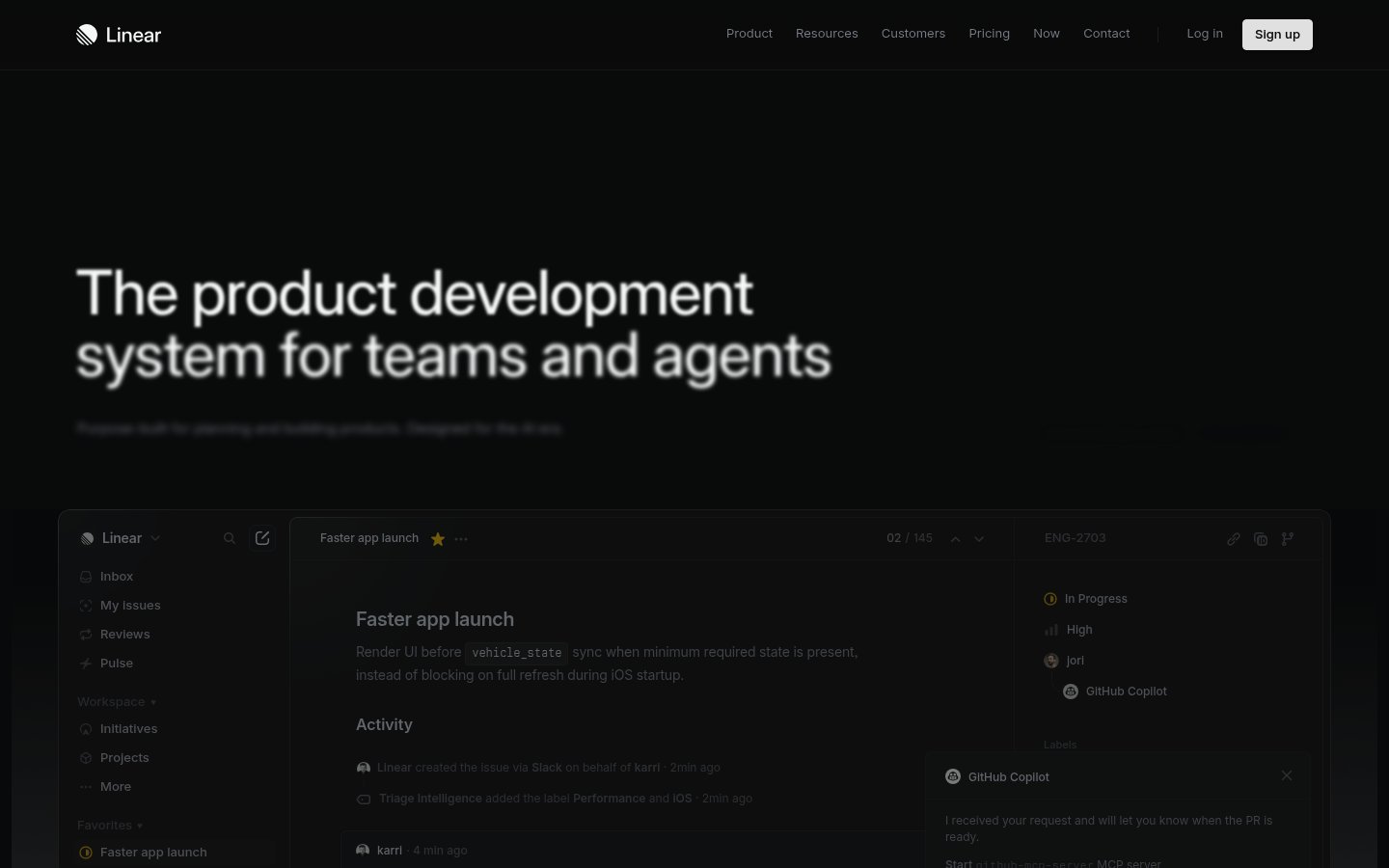
Heading system
Inter · 18–36px / 400
Body system
SF Mono · 14–16px / 400 / 1.6
Headings: Semibold sentence case, ~48px hero, normal letter-spacing, high contrast against dark background
Body: ~14-16px regular weight, muted gray (#8a8f98) for secondary text, comfortable line-height ~1.5
Hierarchy: Strong hero heading dominates, body text subdued in gray, monospace for code/technical elements, minimal heading levels visible
geometric neo-grotesque sans
Possibly: Inter
monospace technical
Possibly: SF Mono
Letters
Aa Bb Cc Dd
Ee Ff Gg Hh Ii
Jj Kk Ll Mm
Nn Oo Pp Qq
Rr Ss Tt Uu
Vv Ww Xx Yy Zz
Numbers
01 02 03 04 05
06 07 08 09
Layout
dashboard
Density
balanced
Spacing
comfortable
Framing
Three-column layout in product UI: narrow sidebar (~200px)
Design Principles
- Information hierarchy through grayscale value contrast, not color
- Product UI as the hero — show don't tell
- Monospace typography signals technical credibility
- Minimal color accent reserved for interactive states and status indicators
- Dark mode as default signals power-user positioning
Signature Moves
Color: Near-monochromatic dark palette uses white for primary text, mid-gray for secondary content, and reserves color exclusively for status indicators (green for progress, yellow for favorites, purple for the brand accent).
Typography: Inter provides neutral professionalism while monospace code snippets (vehicle_state) reinforce the developer-first positioning. Weight and color value create hierarchy rather than size variation.
Grid: Three-column layout in product UI: narrow sidebar (~200px), wide main content area, right detail panel (~280px). Marketing hero is full-width centered
Flow: Hero section flows into embedded product screenshot demonstrating the actual interface
Whitespace: Generous padding around hero text, compact but breathable spacing within the app UI components
Aesthetic
minimal
Feel
technical
Industry
developer-tool
Linear showcases a refined dark-mode aesthetic that prioritizes information density without sacrificing clarity. The design demonstrates exceptional restraint — using subtle grays and precise typography to create visual hierarchy within a predominantly monochromatic palette. The embedded product UI screenshot serves as both hero content and social proof, showing the actual interface designers and developers will use. The overall effect is professional, fast, and engineered.
Navigation
top bar
CTA Style
filled button
Title block
Description copy reflects the measured line length, icon offset, and CTA spacing.
Scale
Gaps
Card Padding
The design immediately signals 'built by engineers, for engineers' through its dark theme, information density, and lack of decorative elements. Showing the actual product as the hero instantly communicates what Linear does, building trust through transparency rather than marketing abstractions.
Key Strengths
- Pure black background creates maximum contrast and feels 'native' to developer environments
- Real product screenshot eliminates guesswork about what users are signing up for
- Sidebar navigation in the screenshot mirrors familiar IDE/Slack patterns
- Activity feed and status badges demonstrate feature depth without requiring clicks
- Restrained color palette means the few colored elements carry significant meaning
Target Audience
Software development teams and technical product managers who value speed, keyboard shortcuts, and information density over visual polish.
Steps
- 01Set background to pure black (#000000) and commit to dark-mode-first design
- 02Choose Inter or similar geometric sans-serif, pair with monospace for code elements
- 03Establish gray scale: white (#ffffff) for headings, mid-gray (#8a8f98) for body/secondary text
- 04Build three-column dashboard layout: collapsible sidebar, main content, detail panel
- 05Design compact cards with minimal padding (~16px) and subtle borders or background shifts
- 06Use border-radius sparingly — ~6px for buttons, ~8px for cards
- 07Add color only for semantic meaning: green=success, yellow=starred, purple=brand accent
- 08Include real product screenshots or embedded app UI as primary marketing content
Key Decisions
- Pure black vs dark gray background — Linear chose pure black for maximum authority
- Real UI vs illustrations — showing actual product builds credibility
- Text hierarchy through value contrast, not size — keeps density high
- Minimal nav items with clean separation — reduces cognitive load
- Sidebar icon + text pattern for scannable navigation
Pitfalls to Avoid
- ✕Adding gradients or glows that undermine the minimal severity
- ✕Using too many accent colors — defeats the intentional restraint
- ✕Making the product screenshot too small to read — it needs to be functional
- ✕Softening the black background to dark gray — loses the distinctive edge
CSS Variables
:root {
  --primary: #ffffff;
  --secondary: #8a8f98;
  --accent: #5e6ad2;
  --bg: #000000;
  --bg-elevated: #1a1a1a;
  --bg-card: #141414;
  --radius: ~6px;
  --radius-lg: ~12px;
  --font-body: Inter;
  --font-mono: SF Mono;
}
Key Techniques
- CSS custom properties for consistent theming
- Subtle box-shadow or border for card elevation on pure black
- Grid or flexbox for three-column dashboard layout
- Transition on opacity/background for hover states
- Monospace font-family for code snippets inline
Framework: Next.js or Remix with Tailwind CSS would match Linear's apparent stack. Radix UI primitives for accessible dropdowns and sidebars.
Responsive: Sidebar likely collapses to hamburger menu on mobile, right panel becomes a modal or slides from edge. Main content takes full width on smaller screens.
Do
- ✓Use pure black for backgrounds to maximize contrast and authority
- ✓Show your actual product UI prominently — it builds trust
- ✓Reserve color exclusively for meaningful status indicators
- ✓Use monospace fonts for any code or technical content
- ✓Keep navigation items minimal and well-organized
- ✓Maintain consistent spacing rhythm throughout the interface
Don't
- ✕Add decorative illustrations or abstract graphics
- ✕Use multiple accent colors — pick one and stick to it
- ✕Soften the black background to gray — it dilutes the brand
- ✕Add hover effects with too much visual movement
- ✕Use rounded corners larger than ~8px — keeps it sharp and technical
- ✕Hide your product behind multiple clicks — confidence sells
Create a dark-mode SaaS landing page for a developer productivity tool. Use pure black (#000000) background with white (#ffffff) headings and mid-gray (#8a8f98) body text. Primary font is Inter, use SF Mono or similar for any code elements. Hero section should feature a large headline (~48px semibold) with a real product screenshot below showing a three-column dashboard layout. Navigation is a minimal top bar with logo left, text links center-right, and a filled white 'Sign up' button. Cards use #141414 background with ~6px border-radius and ~16px padding. Accent color is purple (#5e6ad2) for links and interactive states. Status indicators use green for progress, yellow for starred items. Keep spacing comfortable but not airy — this is a power-user tool. No gradients, no decorative elements, no illustrations. The aesthetic is precise, engineered, and confidently minimal. Border-radius stays under 8px throughout. Shadows are subtle or absent.
Generated from visual analysis — verify specific values before use.
Free to start
See the language behind great design
Analyze any website. Learn its palette, type system, and layout DNA — then prompt it precisely.