Stripe
stripe.com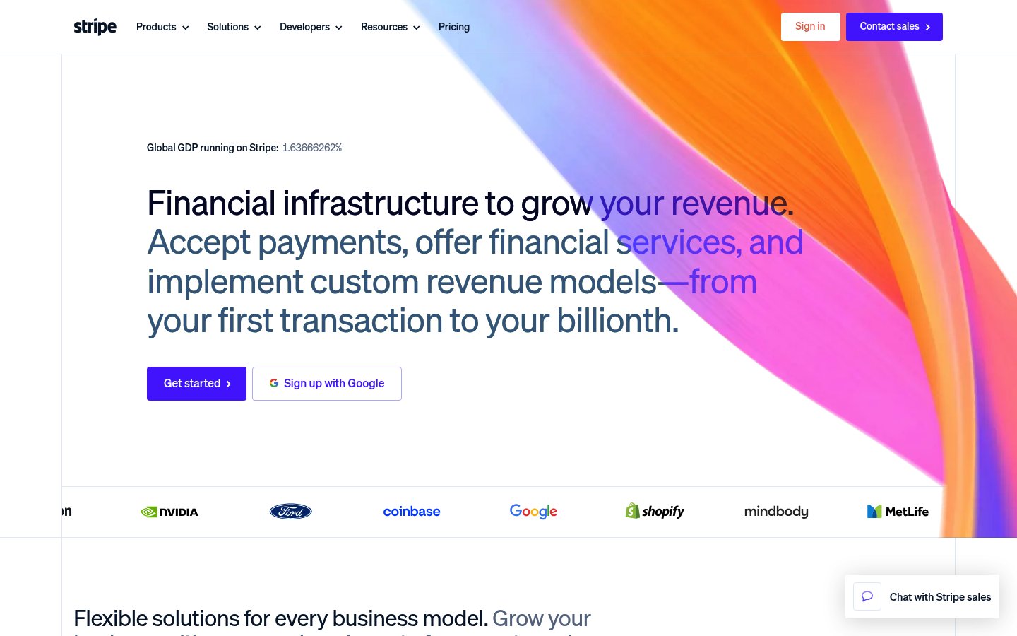
Heading system
Sohne · 24–48px / 400
Body system
Sohne Mono · 14–16px / 400 / 1.6
Headings: Bold to medium weight, mixed color treatment with gradient accents, ~52px hero size, generous line-height
Body: ~16px regular weight, dark navy text, comfortable 1.5 line-height for readability
Hierarchy: Strong headline/subhead distinction using color shifts (navy to purple/orange) rather than just size, monospace for data labels
humanist sans-serif
Possibly: Sohne
technical monospace
Possibly: Sohne Mono
Letters
Aa Bb Cc Dd
Ee Ff Gg Hh Ii
Jj Kk Ll Mm
Nn Oo Pp Qq
Rr Ss Tt Uu
Vv Ww Xx Yy Zz
Numbers
01 02 03 04 05
06 07 08 09
Layout
single-column
Density
sparse
Spacing
airy
Framing
Centered content container ~1200px max-width
Design Principles
- Color within typography creates hierarchy without weight variation
- Animated gradients add life without distracting from content
- Whitespace signals enterprise-grade trust and stability
- Data as design element (live GDP counter) builds credibility
- Dual CTA pattern (primary + social login) maximizes conversion
Signature Moves
Color: Purple primary (#635bff) establishes brand recognition while orange and pink gradients in the hero create warmth and energy. Navy text on white ensures readability while feeling more sophisticated than pure black.
Typography: Sohne's humanist warmth balances the technical fintech subject matter, while monospace accents on data points signal precision and developer credibility.
Grid: Centered content container ~1200px max-width, generous horizontal margins, left-aligned hero text
Flow: Hero with animated gradient background, logo bar social proof, feature sections below
Whitespace: Extensive whitespace frames content, creates premium feel, breathing room around CTAs
Aesthetic
minimal
Feel
elegant
Industry
fintech
Stripe's homepage exemplifies premium fintech design through its signature animated gradient hero, which creates visual intrigue while maintaining clarity. The typography strategy uses color as hierarchy—shifting from navy to purple and orange within headlines—rather than relying solely on weight changes. The sparse layout with generous whitespace projects enterprise confidence, while the real-time GDP counter adds a data-driven credibility element. It's a masterclass in making infrastructure feel beautiful.
Navigation
top bar
CTA Style
filled button
Title block
Description copy reflects the measured line length, icon offset, and CTA spacing.
Scale
Gaps
Card Padding
The design transforms complex financial infrastructure into something approachable and premium. The animated gradient creates immediate visual interest while the sparse layout and enterprise logos build trust—exactly what a payments company needs.
Key Strengths
- Animated gradient hero differentiates from static competitors
- Color-based type hierarchy is sophisticated and memorable
- Live GDP counter creates urgency and scale perception
- Logo bar with Google, Shopify, Ford establishes instant credibility
- Clear dual CTA paths for different user intents
Target Audience
Technical decision-makers at growth-stage to enterprise companies evaluating payment infrastructure—developers and finance leaders who value both functionality and design quality.
Steps
- 01Start with white background and navy (#0a2540) as primary text color
- 02Implement animated mesh gradient using CSS or WebGL for hero background
- 03Set up Sohne or similar humanist sans-serif (Inter works as free alternative)
- 04Create headline component that accepts array of text segments with individual colors
- 05Add monospace font for numerical/data elements
- 06Build filled purple button with white text, rounded corners ~8px
- 07Add outlined secondary button with icon support
- 08Create logo bar component with grayscale filter on hover
Key Decisions
- Using color shifts within text instead of weight changes for hierarchy
- Keeping background pure white to let gradient hero pop
- Choosing purple over blue to stand apart from traditional finance
- Animated rather than static gradient for premium feel
Pitfalls to Avoid
- ✕Don't make gradient colors too saturated—keep them flowing and organic
- ✕Avoid pure black text—navy is warmer and more sophisticated
- ✕Don't overcrowd the hero—Stripe's power is in restraint
- ✕Don't use generic stock gradients—the organic flowing shape is essential
CSS Variables
:root {
  --primary: #635bff;
  --secondary: #0a2540;
  --accent: #ff7a00;
  --bg: #ffffff;
  --text: #0a2540;
  --radius: ~8px;
  --font-body: Sohne, Inter, system-ui;
  --font-mono: Sohne Mono, monospace;
}
Key Techniques
- CSS/WebGL mesh gradient animation for hero background
- Inline spans with different colors for multi-color headlines
- CSS transitions on buttons and interactive elements
- Intersection Observer for scroll-triggered animations
- CSS grayscale filter for logo bar
Framework: React or Next.js with Framer Motion for animations. Consider Three.js or custom WebGL for the gradient mesh. Tailwind CSS works well for the utility-based spacing system.
Responsive: Hero text likely scales down significantly on mobile, gradient simplifies. Navigation collapses to hamburger. Logo bar may become carousel or stack vertically.
Do
- ✓Use generous whitespace to create premium feel
- ✓Animate subtly—the gradient moves slowly, not frantically
- ✓Mix colors within headlines for visual interest
- ✓Include real data or metrics for credibility
- ✓Keep navigation clean with clear hierarchy
- ✓Use purple consistently as primary action color
Don't
- ✕Don't use pure black for text—it's too harsh
- ✕Don't make the gradient animation too fast or distracting
- ✕Don't crowd the hero with too many elements
- ✕Don't use generic blue—purple is part of the brand
- ✕Don't forget the social proof elements (logos, stats)
- ✕Don't use harsh borders—Stripe prefers shadows and whitespace
Create a fintech landing page in the Stripe style. Use a white (#ffffff) background with navy (#0a2540) text. Primary accent is purple (#635bff) for buttons and links. Hero section has an animated organic gradient background flowing from purple through pink (#f771a5) to orange (#ff7a00). Headlines are large (~52px), medium weight, with different segments colored differently (navy, purple, orange) within the same line. Use a humanist sans-serif like Inter. Buttons are rounded (~8px radius) with the primary CTA filled purple, secondary outlined. Include a real-time counter element in monospace showing a statistic. Below the fold, add a logo bar with grayscale company logos (use filter: grayscale). Spacing is very generous—sections have ~120px vertical padding. Keep the layout single-column and centered with ~1200px max-width. The overall feel should be premium, confident, and sophisticated—enterprise fintech, not startup casual.
Generated from visual analysis — verify specific values before use.
Free to start
See the language behind great design
Analyze any website. Learn its palette, type system, and layout DNA — then prompt it precisely.