Vercel
vercel.com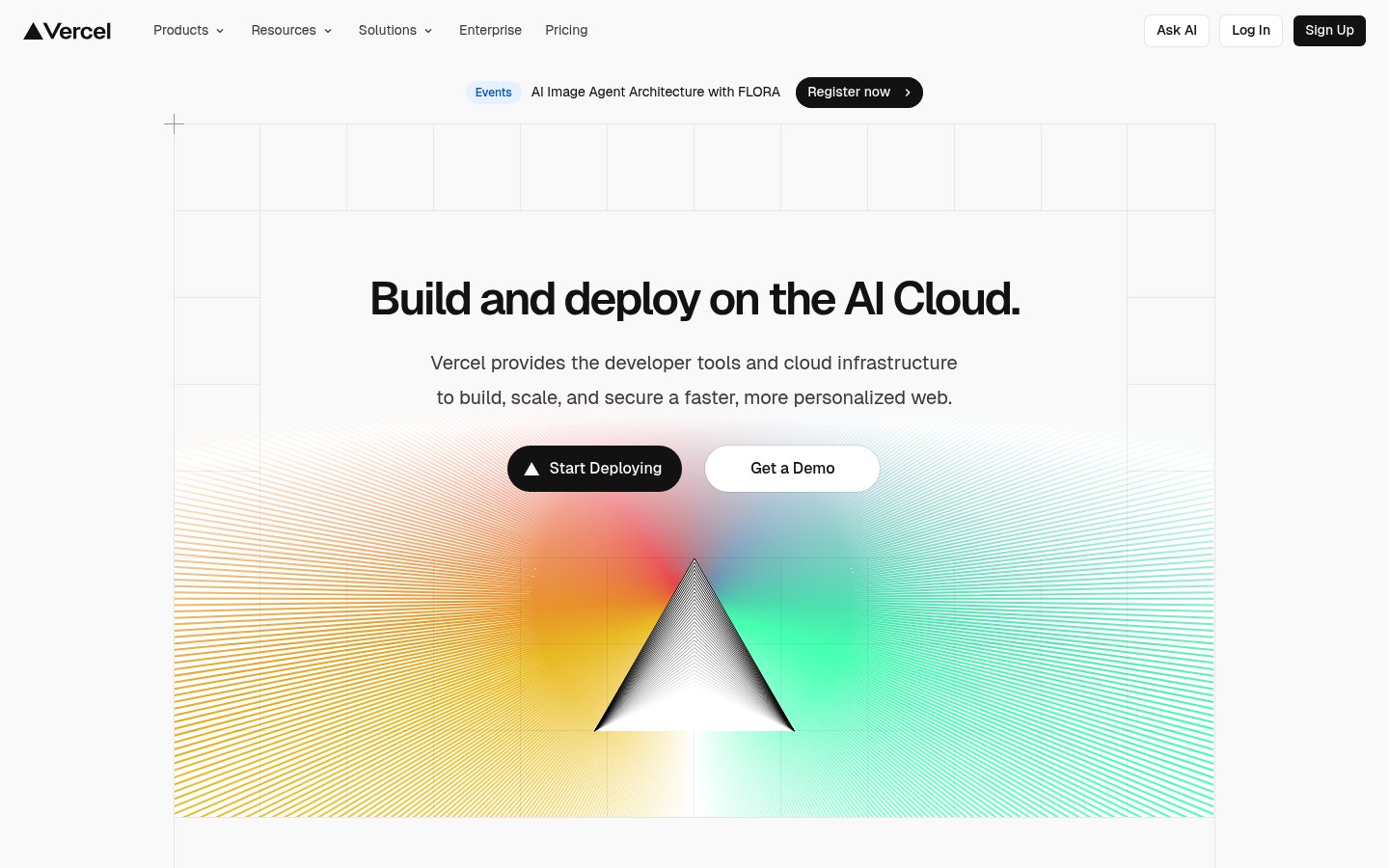
Heading system
Geist · 18–36px / 400
Body system
Geist Mono · 14–16px / 400 / 1.6
Headings: Bold black sans-serif, centered, ~48px hero with tight tracking
Body: ~18px/1.6 regular weight gray text, comfortable reading width
Hierarchy: Single dominant headline, subdued body text, minimal hierarchy levels with high contrast between levels
geometric humanist sans-serif
Possibly: Geist
geometric monospace
Possibly: Geist Mono
Letters
Aa Bb Cc Dd
Ee Ff Gg Hh Ii
Jj Kk Ll Mm
Nn Oo Pp Qq
Rr Ss Tt Uu
Vv Ww Xx Yy Zz
Numbers
01 02 03 04 05
06 07 08 09
Layout
single-column
Density
sparse
Spacing
airy
Framing
Centered single-column layout with ~1200px max-width
Design Principles
- Let one hero element command attention—everything else recedes
- Use whitespace as a structural element, not empty space
- Limit color palette to black, white, and one gradient focal point
- Typography must feel engineered, not decorative
- Grid systems should be visible philosophy, not hidden scaffolding
Signature Moves
Color: Near-monochrome foundation with a single chromatic explosion—the gradient contains the full spectrum but is contained within a geometric shape, suggesting controlled power and AI capability.
Typography: Geist font family (Vercel's own typeface) signals ownership and technical credibility. The geometric-humanist hybrid feels both approachable and engineered—perfect for developer tools aiming at broad adoption.
Grid: Centered single-column layout with ~1200px max-width, subtle background grid pattern visible
Flow: Announcement banner → Hero section with centered text → Gradient visual element → Content below fold
Whitespace: Generous vertical padding between elements, hero content floats in expansive white space to create focus
Aesthetic
minimal
Feel
technical
Industry
developer-tool
Vercel's homepage exemplifies developer-focused minimal design with maximum visual impact. The stark white canvas amplifies a stunning prismatic gradient illustration that disperses into geometric line patterns, creating an 'AI light spectrum' metaphor. Typography is restrained yet confident—a single bold headline paired with muted body text. The dual CTA pattern (filled black primary, outlined secondary) is a Vercel signature that has influenced countless SaaS sites.
Navigation
top bar
CTA Style
filled button
Title block
Description copy reflects the measured line length, icon offset, and CTA spacing.
Scale
Gaps
Card Padding
This design succeeds by combining technical credibility with visual wonder. The austere layout signals engineering precision while the prismatic hero suggests limitless creative potential—exactly what developers want from deployment infrastructure.
Key Strengths
- Hero gradient creates instant visual memory and brand recognition
- Extreme restraint in copy creates confidence—only essential information survives
- Background grid subtly reinforces 'infrastructure' positioning without overt metaphor
- CTAs have clear visual hierarchy without competing for attention
- Announcement bar provides timely content without disrupting core message
Target Audience
Frontend developers and engineering teams evaluating deployment platforms—technically sophisticated users who value both performance and design quality.
Steps
- 01Set up a pure white (#fafafa) background with subtle gray grid overlay using CSS background-image
- 02Create a centered single-column container with ~1200px max-width and generous vertical padding (~120px sections)
- 03Implement top navigation with logo left, dropdown menus center, and action buttons right
- 04Add an announcement bar above navigation with pill badge, text, and arrow link
- 05Build hero section with large bold heading (~48px), muted subheading, and two horizontally-aligned CTAs
- 06Create gradient illustration using SVG or canvas—prism shape with spectrum colors dispersing into line patterns
- 07Use Geist or Inter font family with careful weight distribution (bold headings, regular body)
- 08Ensure all interactive elements have subtle hover transitions (~150ms)
Key Decisions
- Choosing a single dramatic visual element over multiple competing graphics
- Using the brand triangle in both logo and hero illustration for coherence
- Keeping body text gray (#6b7280) to maintain headline dominance
- Pill-shaped CTA buttons with substantial padding for touch-friendly targets
- Background grid at very low opacity (~5%) for texture without distraction
Pitfalls to Avoid
- ✕Adding more colors to the base palette—the power is in restraint
- ✕Making body text too dark and competing with the headline
- ✕Overcomplicating the navigation with too many items
- ✕Using generic gradient blobs instead of precise geometric forms
- ✕Forgetting the micro-interactions that make minimal designs feel premium
CSS Variables
:root {
  --primary: #000000;
  --bg: #fafafa;
  --text-muted: #6b7280;
  --radius: ~9999px;
  --font-body: Geist, Inter, system-ui;
  --font-mono: Geist Mono, monospace;
  --nav-height: ~64px;
  --container-max: ~1200px;
}
Key Techniques
- CSS Grid for background pattern overlay
- SVG gradients with feColorMatrix for prismatic effects
- Backdrop-filter for potential glass effects in navigation
- CSS custom properties for theme consistency
- Container queries or clamp() for responsive typography
Framework: Built with Next.js (Vercel's own framework). Tailwind CSS aligns well with this utility-driven minimal approach. Framer Motion for subtle animations.
Responsive: Single-column layout scales naturally. Hero text likely uses fluid typography. CTAs may stack vertically on mobile. Navigation collapses to hamburger menu on smaller screens.
Do
- ✓Keep the color palette almost entirely monochrome with one accent area
- ✓Use generous whitespace—more than feels comfortable initially
- ✓Make one element the undeniable visual focus
- ✓Choose typography that feels technical but readable
- ✓Include subtle grid or geometric patterns for texture
- ✓Ensure buttons have high contrast and clear states
Don't
- ✕Add decorative elements that don't serve communication
- ✕Use multiple gradient areas competing for attention
- ✕Make subheadings nearly as prominent as headlines
- ✕Clutter the navigation with too many options
- ✕Use rounded rectangles inconsistently—commit to pill shapes or subtle rounding
- ✕Forget hover and focus states on interactive elements
Create a minimal developer-tool landing page with Vercel's aesthetic. Use a #fafafa white background with subtle gray grid pattern overlay at ~5% opacity. Typography: Geist or Inter font, hero headline in bold black at ~48px, body text in muted gray #6b7280. Single-column centered layout with ~1200px max-width and ~120px section padding. Navigation: logo left, dropdown menus center, three right-aligned buttons (outlined, outlined, filled black with white text). Hero section: bold headline, two-line muted subheading, two CTAs side-by-side (primary: black filled pill button with icon, secondary: white outlined pill button). Below CTAs: dramatic full-width prismatic gradient illustration—triangle/prism shape dispersing rainbow spectrum into fine geometric lines. All buttons use pill shape (border-radius: 9999px) with ~16px horizontal padding. Hover transitions at 150ms ease. Overall feel: precise, technical, confident, spacious.
Generated from visual analysis — verify specific values before use.
Free to start
See the language behind great design
Analyze any website. Learn its palette, type system, and layout DNA — then prompt it precisely.